Coroot v1.0: Revolutionizing Distributed Tracing Analysis
 Nikolay Sivko
TL;DR
We’re excited to announce Coroot v1.0 – our first stable version. It includes some great improvements, such as a new Distributed Tracing interface that takes troubleshooting to the next level.
In this post, we’ll compare existing open-source distributed tracing tools, identify unsolved problems in the troubleshooting process, and see how Coroot can address them with its brand-new distributed tracing feature.
Distributed Tracing
These days, software is getting more complicated. To make things faster, companies split big apps into smaller pieces called microservices. But when something goes wrong, finding the issue can be tough.
That’s where distributed tracing helps out. It’s like a map for your software, showing how requests move between different parts. By using tracing tools, you can quickly spot why a particular request fails or takes longer than expected.
All the process of integrating Distributed Tracing into your system involves the following steps:
- Instrument your applications with tracing SDKs: the OpenTelemetry project does an excellent job of standardizing how we instrument applications to generate distributed tracing data.
- Choose a backend storage for telemetry data: select a backend storage solution for storing telemetry data. Options include both open source and commercial solutions such as Jaeger, Newrelic, Datadog, Grafana, and Coroot😉.
- Leverage distributed tracing data for performance insights: Learn how to use distributed tracing data to understand your system’s performance and pinpoint the root causes of issues.
In this post, we’ll focus on the last step because there’s a lack of clear guidance on using distributed tracing for troubleshooting. While many resources explain single request analysis, what about dealing with hundreds or even thousands of requests per second?
Before we start, let’s outline the questions we want answered about our system:
- How is our system performing?
- How does its performance compare to an hour ago?
- Why are some requests failing?
- Why are certain requests taking longer than expected?
Lab
As a demo application, I’ll use the OpenTelemetry Demo which is a web store application built as a set of microservices that communicate with each other over gRPC or HTTP. This app is already instrumented with OpenTelemetry SDKs and sends traces to an OpenTelemetry collector. On the collector side we can replicate traces across several destinations to compare various tools on the same data.
To learn more on how to deploy this app in a Kubernetes cluster, check out my post Battletesting Coroot with OpenTelemetry Demo and Chaos Mesh.
Jaeger
Jaeger doesn’t provide an overview of the requests handled by the system within a specific time frame. It solely enables users to search for traces based on specific criteria and present a distribution of the selected traces by their duration. What confuses me the most is that you must select a particular service, preventing you from viewing all traces at once.
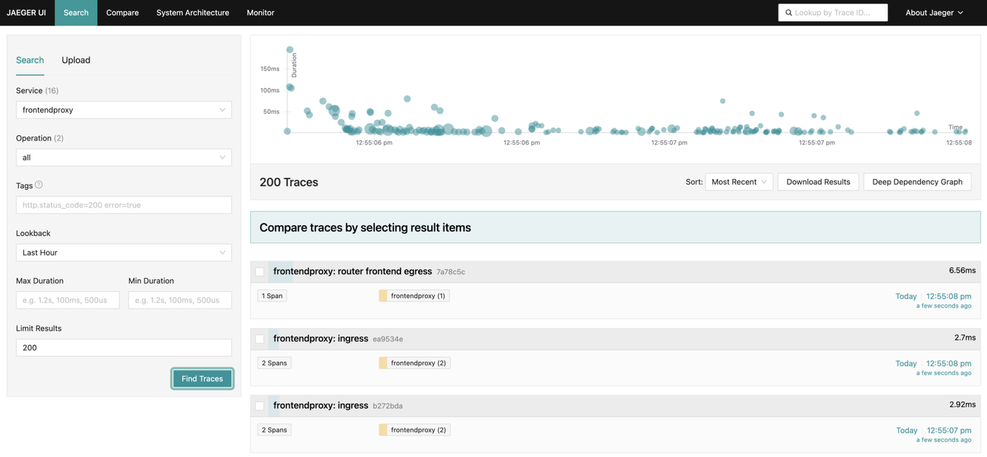
Certainly, while you can identify traces with errors or those exceeding a specific duration threshold, I wouldn’t say it significantly contributes to understanding how the system is performing.
Errors
Let’s inject some errors into our system! The OpenTelemetry demo app comes with a built-in capability to introduce errors. This can be achieved by enabling a feature flag in the Postgres database of the FeatureFlag service:
ffs=# UPDATE featureflags SET enabled = 1 WHERE name = 'productCatalogFailure';
Now, let’s find traces with errors in Jaeger:
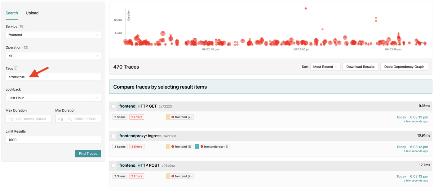
We can then investigate any found trace to determine the reason for its failure:
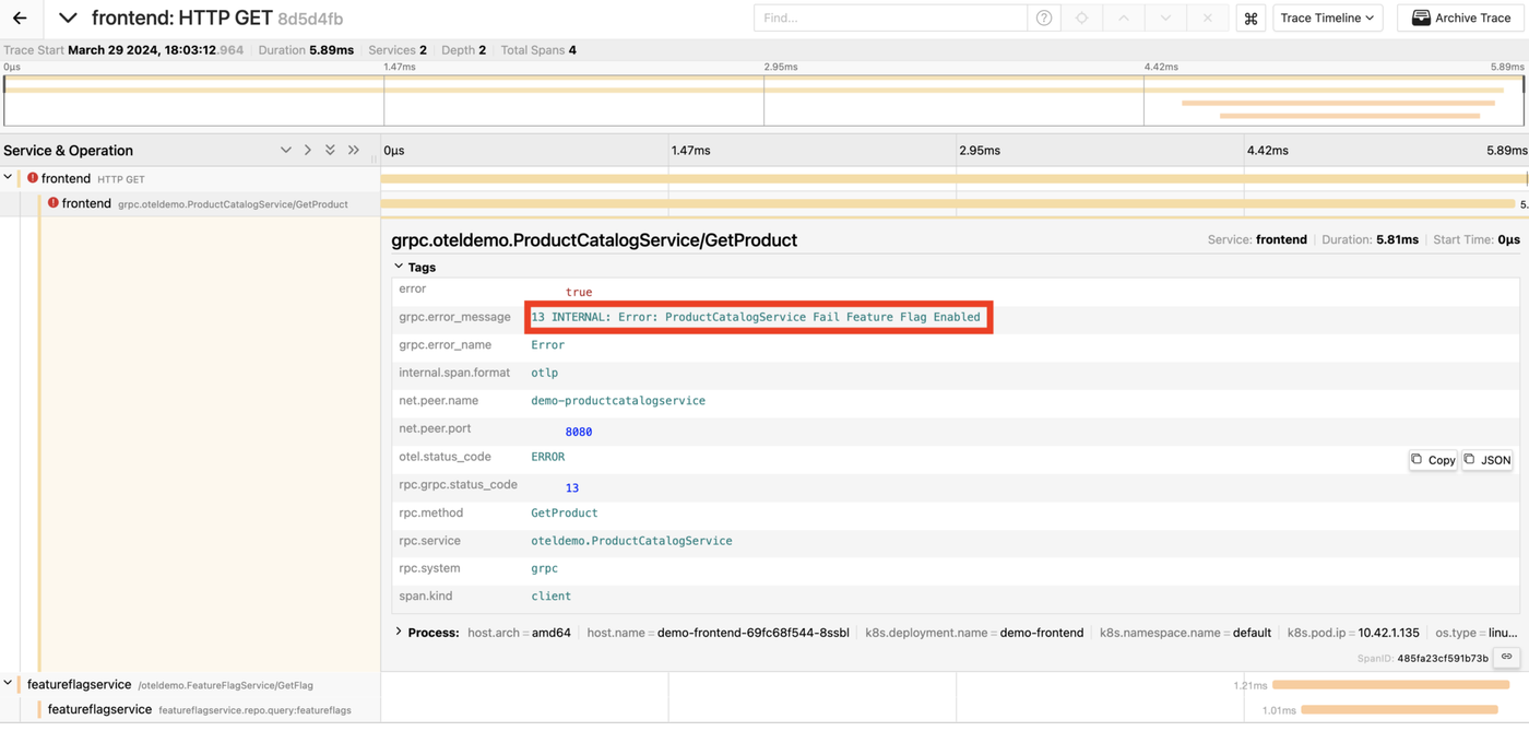
Awesome, we’ve uncovered why this specific request failed!
Yet, we’re still in the dark about the reasons behind other failed requests. Unfortunately, Jaeger doesn’t provide a straightforward method to determine this, so you need to analyze each trace individually, one by one 😕.
Slow requests
Now, let’s intentionally slow down some requests. I’ll use ChaosMesh to introduce a network delay of 300ms between the CartService and the Redis database it relies on.
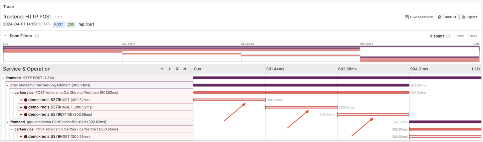
As I mentioned earlier, Jaeger doesn’t provide a latency overview that allows us to compare the system’s performance “before the incident” with the current situation. So, I queried the traces with a duration greater than 300ms. Here’s an example of such traces:
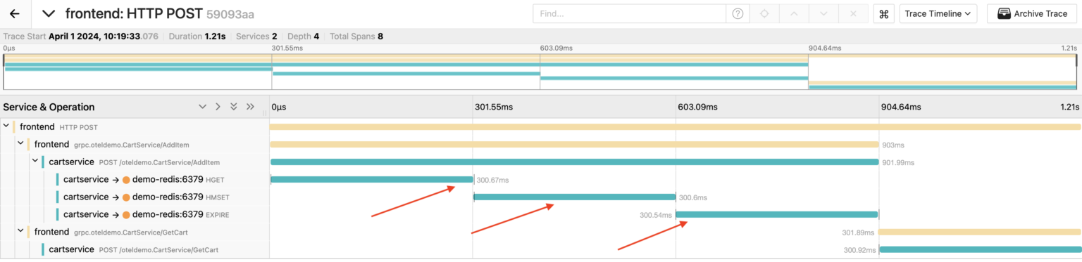
We can see that during the handling of this particular request, the CartService made 3 consecutive calls to the Redis database, each taking about 300ms.
Grafana
In my experiment, I’m using Grafana installed via the OpenTelemetry demo Helm chart. With this setup, Grafana relies on Jaeger as its data source for tracing. This means we’ll have a similar interface for traces: we can only find traces that meet certain criteria and view them individually.
Additionally, Grafana offers dashboards based on metrics generated by the Span Metrics Connector on the collector side. These dashboards summarize the performance of each service, showing the number of operations, their latency, and any errors. Plus, you can dig into specific service dashboards to track their performance over time.
Unfortunately, these dashboards visualize statistics based on individual trace operations (Spans), rather than entire user requests (Traces). In other words, we can’t answer even basic questions about our system, like how many requests it serves, their latency, and errors. Do you agree that measuring user experience metrics is far more important than tracking statistics on each nested service or database call?
Errors
Let’s enable the productCatalogFailure feature flag again and see how errors are seen on our dashboard in Grafana:
It’s definitely an improvement over Jaeger. We can see the number of errors per trace operation. However, it’s still confusing because we’re seeing failures of individual service calls (spans), not user requests.
Now, let’s take a look at a trace that contains an error:
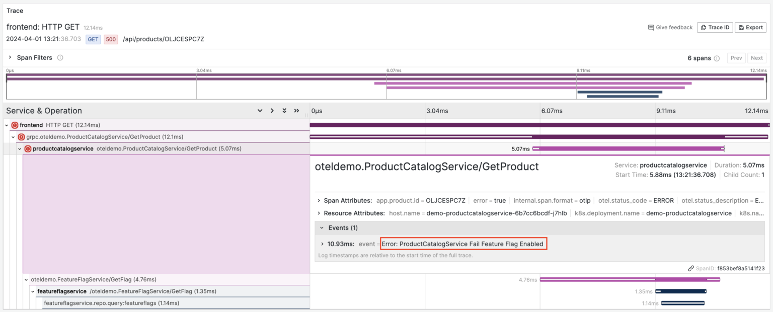
Here, we can observe three failed spans: HTTP GET, grpc.oteldemo.ProductCatalogService/GetProduct, and oteldemo.ProductCatalogService/GetProduct. Essentially, we’re examining a single failed request where an error in one span caused errors in its parent spans. While logically there’s only one error, on the dashboard, each of these errors is shown independently, making troubleshooting a bit more complex.
Slow requests
Next, let’s redo the experiment with request slowdown, adding an extra delay of 300ms in the network between the CartService and the Redis databases it communicates with.
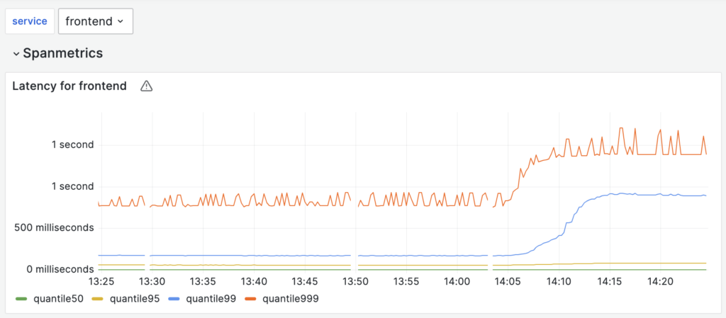
On the dashboard of the frontend service, we notice the latency regression. Unfortunately, the dashboards provided with the OpenTelemetry demo didn’t offer insights into the causes. Nonetheless, we can locate the traces of the “slow” requests and manually analyze each one.
Here it is, we’ve figured out what’s wrong with this particular request.
Coroot
We noticed that while most distributed tracing tools are good at visualizing individual request traces, many struggle to provide a comprehensive overview of system performance. At Coroot, we’ve addressed this challenge by creating a new interface that allows you to easily explore and understand system performance with just a few clicks.
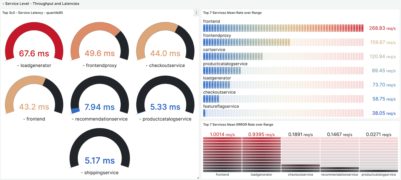
Let’s start from the system’s overview.
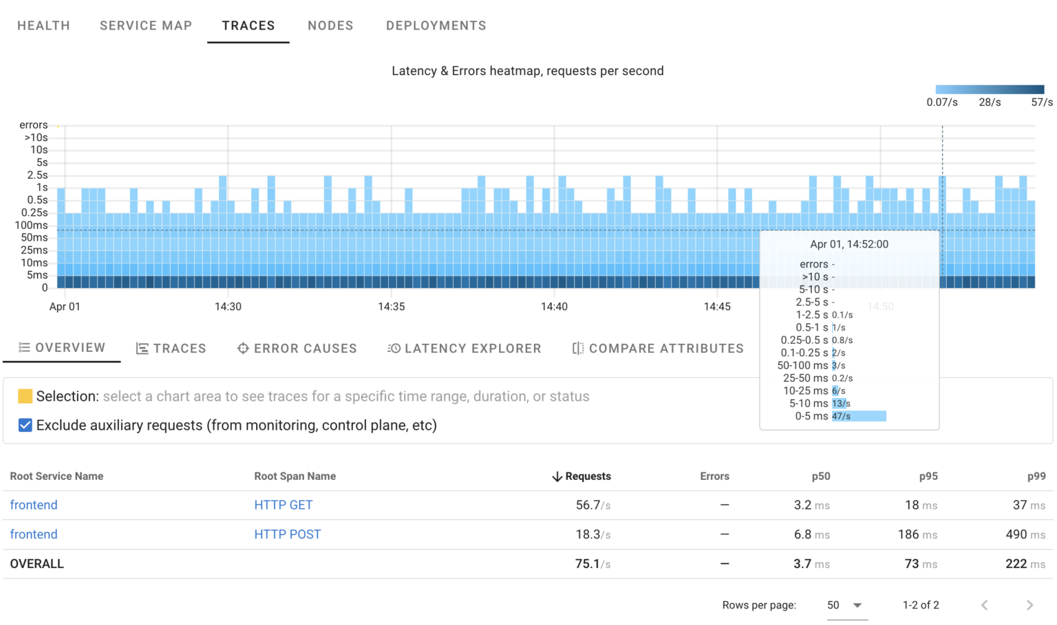
Here’s a HeatMap showing request distribution over time, their statuses, and durations. It indicates that the system is handling roughly 70 requests per second, with most taking less than 250ms and no errors detected.
Errors
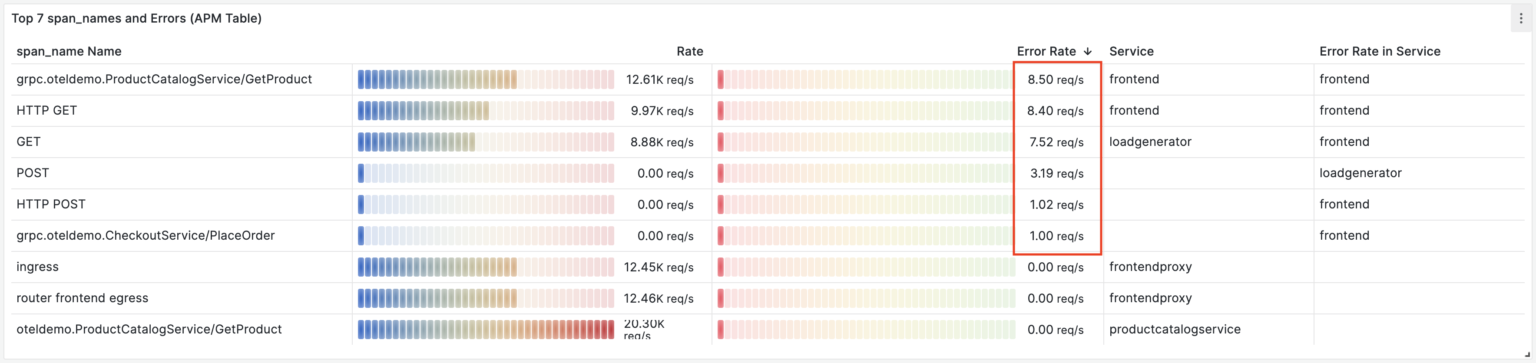
Using HeatMaps it’s easy to spot anomalies. Let’s introduce some errors into the ProductCatalogService once again.
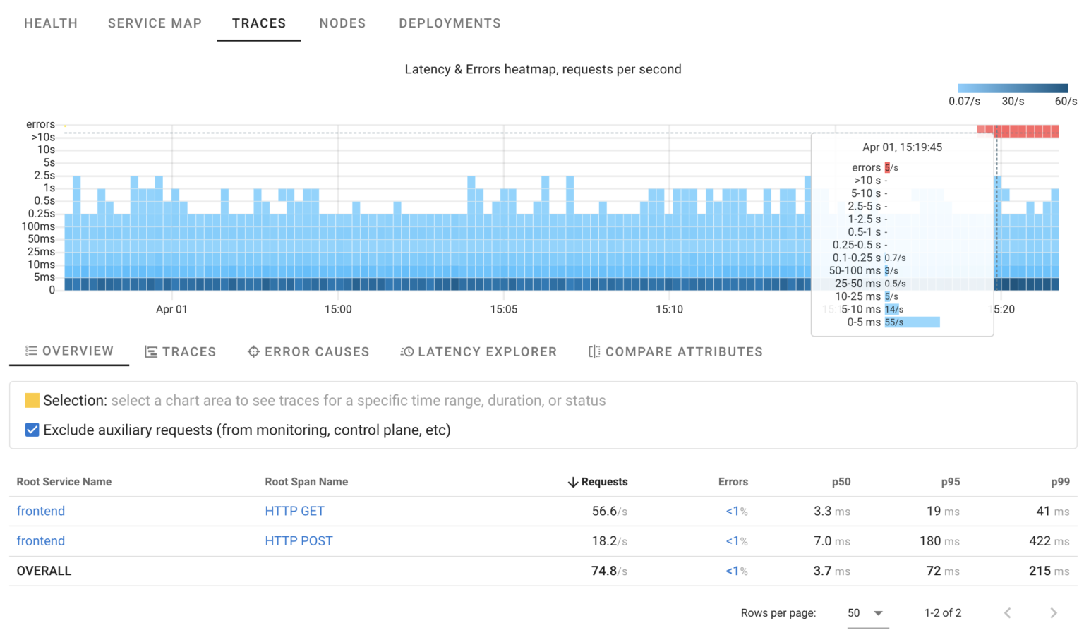
As seen in the HeatMap, there are approximately 5 errors per second. While we know precisely when this started, we’re still unsure about the reasons behind it. Are these errors of a single type, or are multiple failures occurring simultaneously?
By selecting any area on the chart, we can view relevant traces or even summaries of ALL related traces:
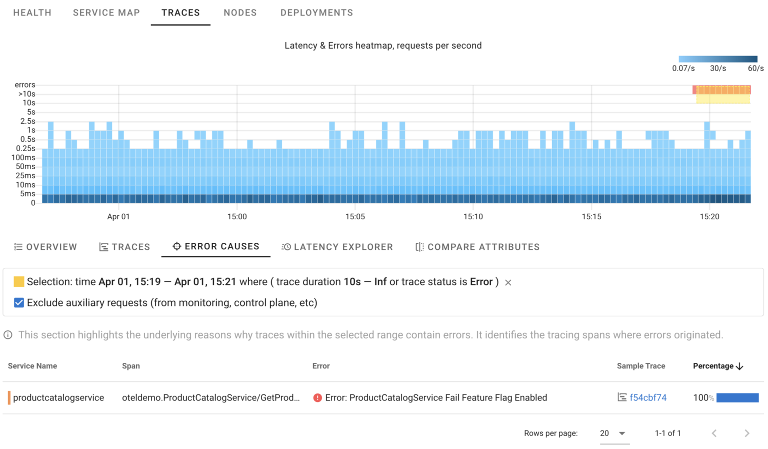
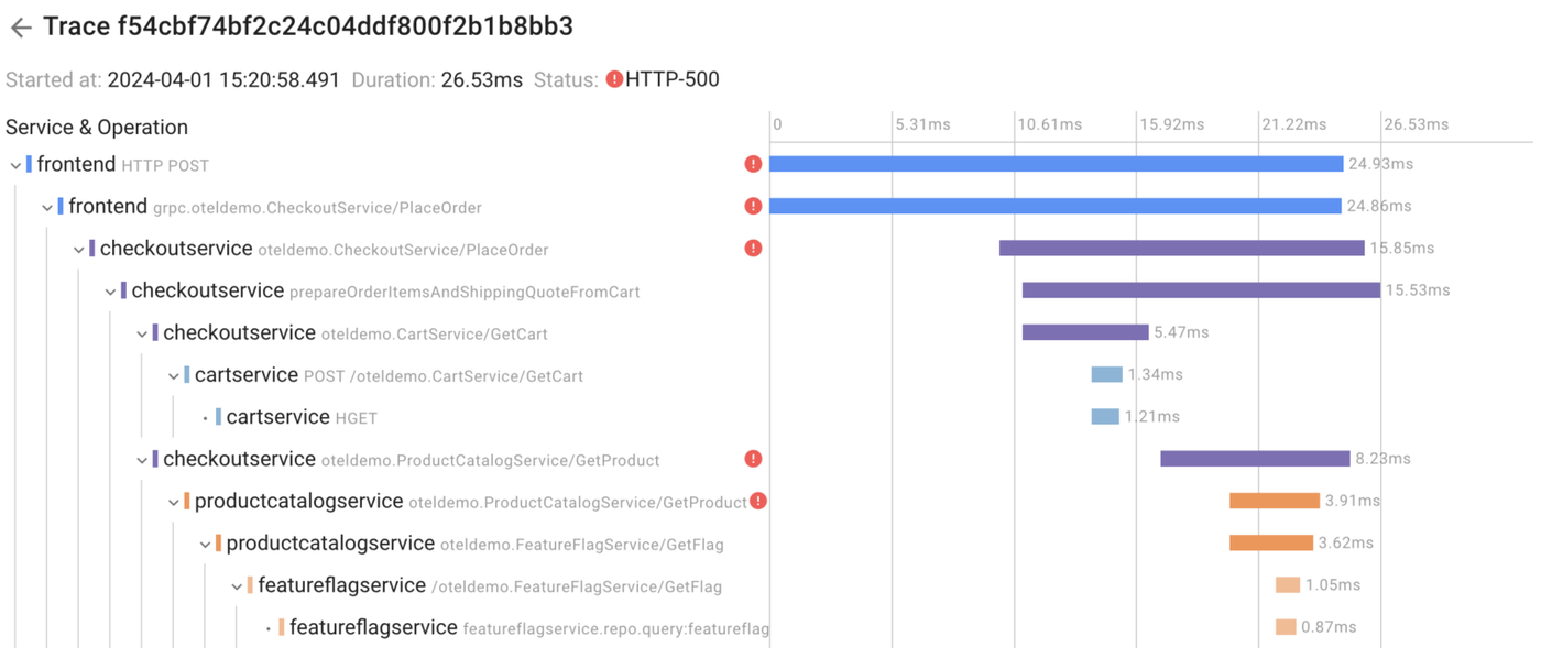
Now, we’re certain that in this specific scenario, 100% of errors were triggered by our intentionally introduced error. It works similarly to manual trace analysis, but Coroot goes a step further by automatically analyzing ALL affected requests and pinpointing only those spans where errors originated.
Of course, you still have the option to manually analyze any trace and crosscheck.
Another question that may arise is how requests within an anomaly differ from other requests. With Coroot you can compare trace attributes within a selected area of the chart with other requests.
This is extremely useful in cases where the system behaves differently when handling requests with specific input data, such as requests from a particular customer or browser type.
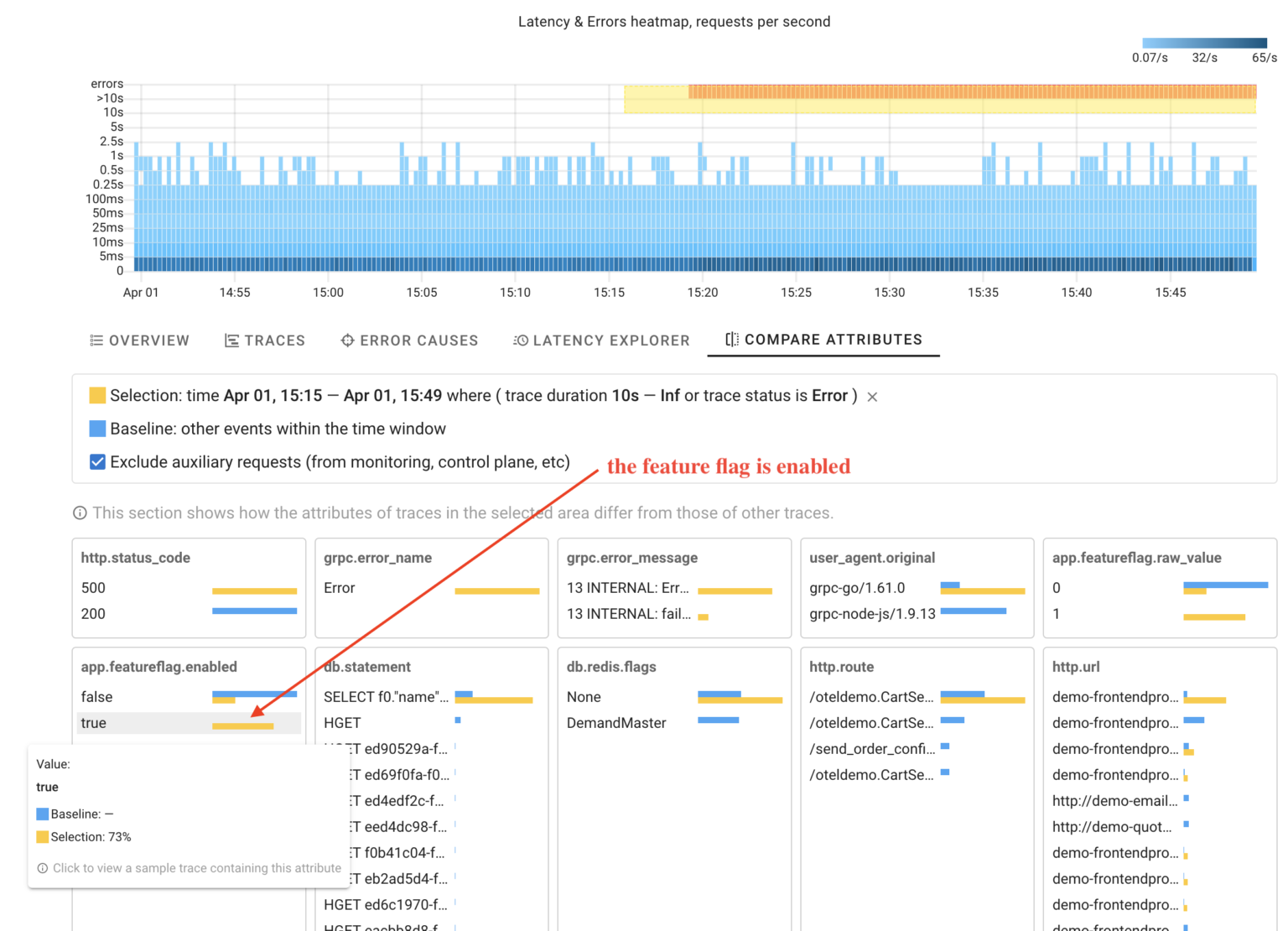
As you can see, Coroot has identified that the selected requests have the attribute indicating that the feature flag was enabled. The coolest thing here is that this feature works without any setup, making it applicable for any custom attributes.
Slow requests
Now let’s examine our failure scenario with the network delay between the CartService and the Redis database.
With Coroot’s HeatMap, it’s easy to identify an anomaly in request processing: certain requests are taking longer than usual.
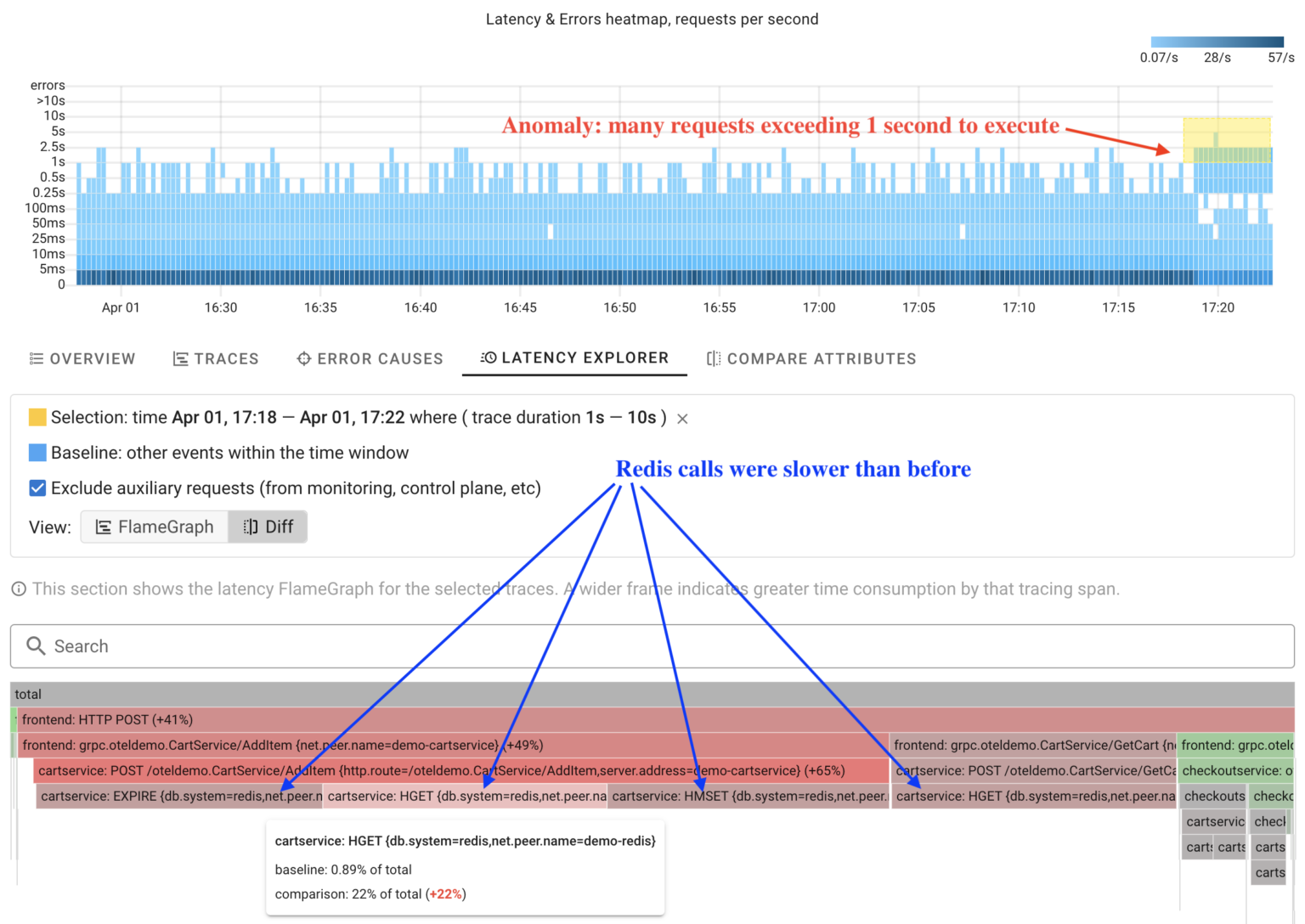
Instead of manually analyzing each trace within the anomaly, Coroot can analyze ALL of them and automatically compare operation durations with other requests in just a few seconds.
The screenshot shows a latency FlameGraph. A wider frame means more time is spent on that tracing span. In comparison mode, Coroot highlights operations in red that take longer than before. This makes it easy to spot changes in the system’s behavior at a glance.
Distributed tracing cannot answer all questions
Tracing is just one of many telemetry signals, and there may be situations where it can’t precisely answer what happened with the system.
I hadn’t intended to discuss any other topics besides distributed tracing in this post, but while I worked on the text, my demo app ran without any chaos experiments for a while. At some point, I noticed some anomalies.
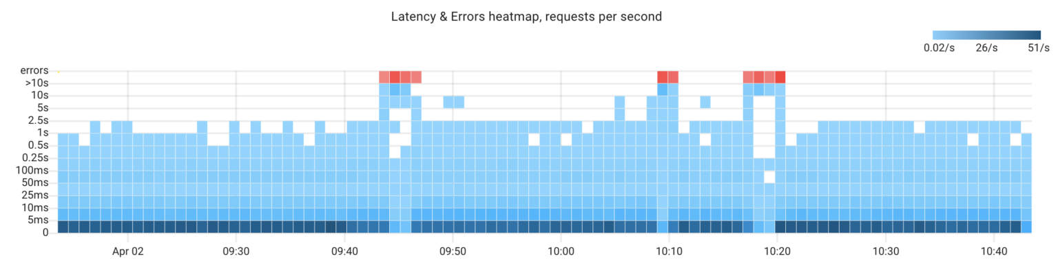
Being obsessed with finding an explanation for any anomaly, I couldn’t let it pass by 🧐. Here we have 3 anomalies, and I have no idea of the reasons behind them. Let’s investigate that together.
Click #1: Errors Causes
First of all, let’s review Coroot’s error analysis:
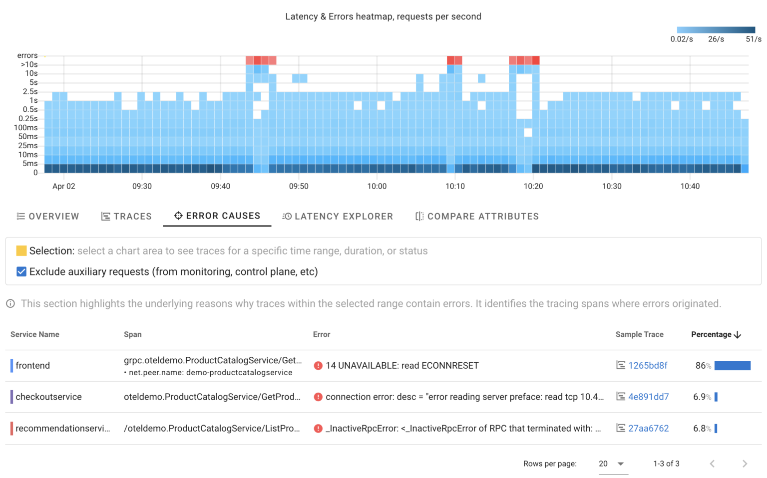
It highlights that all errors are related to ProductCatalogService and indicate that other services could not connect to it. However, knowing that doesn’t help us understand what has happened.
Click #2: ProductCatalogService’s dashboard
Coroot utilizes all telemetry signals, including metrics, logs, traces, and profiles, to identify the root causes of issues and explain anomalies. Think of Coroot’s dashboards as audit reports. It audits every application subsystem and automatically highlights things that are worth your attention. Coroot enriches its reports with charts and other widgets for easy cross-checking, but you no longer need to analyze every chart manually.
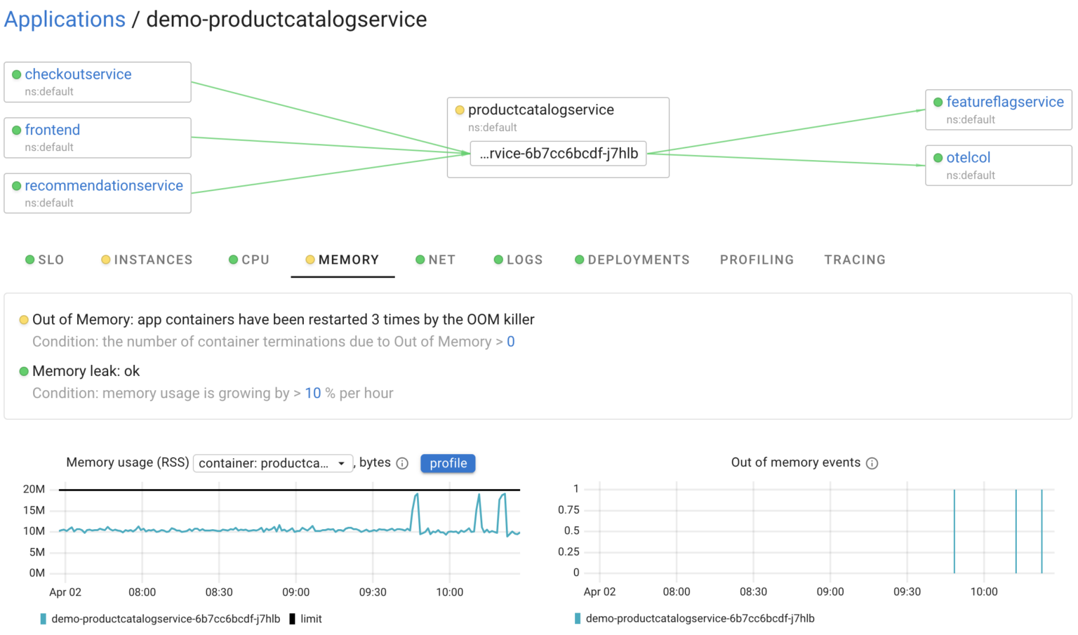
For instance, in this case, it highlighted that the service instances were restarted 3 times during the selected time frame. So, there’s our answer. Pretty easy, isn’t it?
Conclusion
We at Coroot work hard to make even complex systems observable! Coroot v1.0 is a huge milestone for us, and we believe its new features will enable you to troubleshoot like a ninja.
Coroot v1.0.0 is already available, so you can try it out right now.
If you like Coroot, give us a ⭐ on GitHub️ – it helps us reach more engineers and improve our product for you.
Any questions or feedback? Reach out to us on Slack.